Photo by Jim Angel, Champaign, IL, January 28, 2015.
This morning we had a brilliant display of airplane contrails, enough to significantly increase the cloudiness (as if we needed more cloudiness this winter). Despite rumors to the contrary, airplane contrails are just the byproducts of burning jet fuel at high altitudes where the air is very cold and dry. The basic chemistry involves combing a carbon-based fuel and oxygen to produce CO2 and water. CH4 + 2O2 –> CO2 + 2H2O
It’s the same process you see on a cold morning with car exhaust. The water vapor exits the exhaust pipe and condenses when it hits the colder air temperature, resulting in a white fog.
There have been some studies (mentioned below) to suggest that airplane contrails can lead to regional increases in cloudiness over time. As a result, in certain regions the daytime highs may be lower and the nighttime lows higher. In other words, a reduction in the range of daily temperatures. Continue reading “Contrails and Cloudiness”
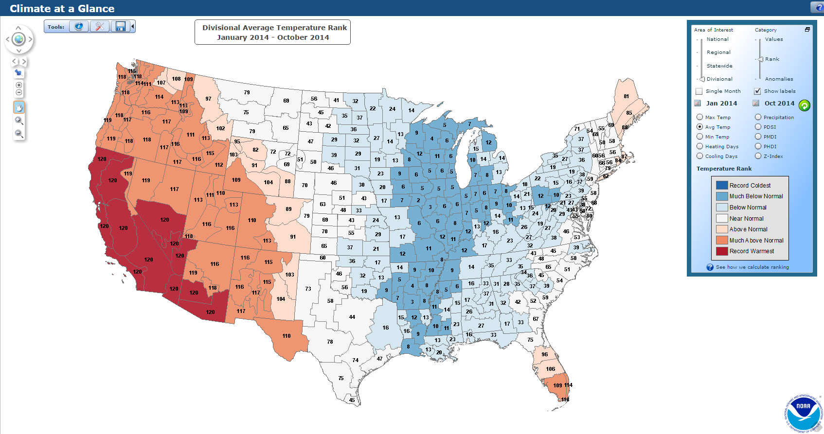
For the period from January through October, the statewide temperature for Illinois was 52.5 degrees, a full 3 degrees below the long-term average of 1981-2010 and the sixth coolest year to date on record with those records going back to 1895. The five colder years were 1904, 1917, 1979, 1912, and 1978.
Of course, you may ask how can we be so cold during a phase of global warming. There are two answers to that. One is that most of the cold weather for 2014 was confined to the central US. While we were cold in the central US, the western US was much warmer than average.
Click to enlarge. Source: NOAA National Climatic Data Center.
… and the central US may go down as one of the few cold spots on average, of any place on earth for 2014 so far (see the blue patch on the global map below).
Click to enlarge. The global temperature covers the period from January through September. Source: National Climatic Data Center
In addition, while 2014 has been colder than average in Illinois (last dot on the time series plot below), it has been the exception to the rule since the early 1980’s.
Click to enlarge. Source: National Climatic Data Center.
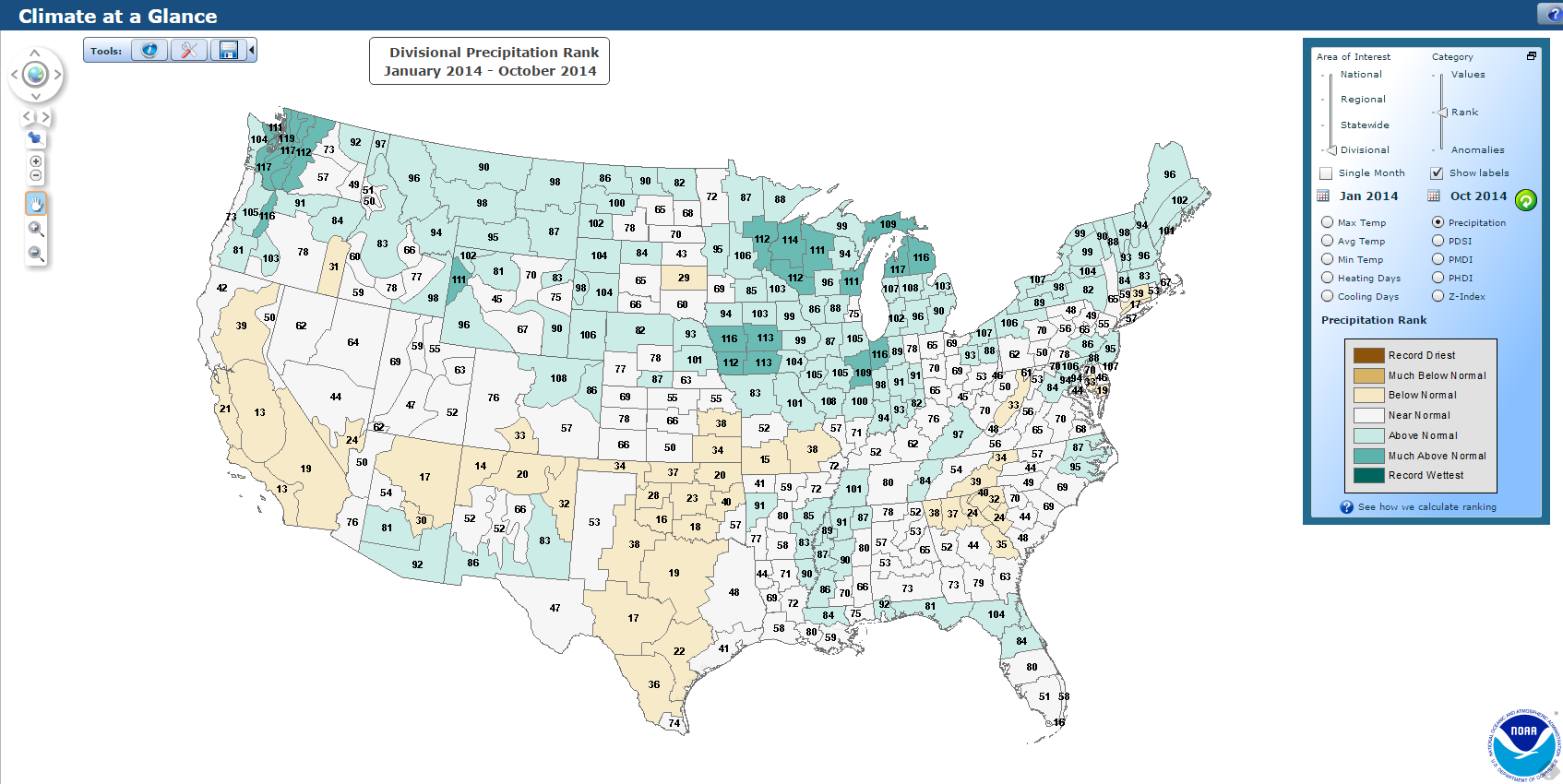
PRECIPITATION
For the same period, the statewide precipitation was 37.47 inches, 3.67 inches above average and the 19th wettest on record. It was a very wet year so far across much of the rest of the Midwest/Great Lakes region, except for dryness in KS and MO.
Click to enlarge. Source: National Climatic Data Center
Below are the monthly temperature and precipitation departures by month for Illinois in 2014. Below the bar plots are the data used in the plots.
For temperature, January, February, and March were exceptionally cold, as was July. April, May, June, August, and October were much closer to average.
For precipitation, we had an interesting bipolar pattern of a dry month followed by a wet month that continued all the way to August before things became consistently wet through October.
*These numbers are preliminary and may change a little as more data comes in.
The recent rains and associated flooding in the Chicago area are reflecting the long-term pattern of wetter conditions in the region. Here are a few samples of that pattern.
First of all, northeast Illinois (Cook and several surrounding counties – see map below) has experienced a shift in precipitation over the last 120 years. This plot shows the amounts for each year as green dots, and an 11-year running average showing longer periods of dry conditions (brown) and wet conditions (green). There is a pretty remarkable shift from a drier climate between 1895 and 1965 with lots of brown, towards a wetter climate from 1966 to present where green dominates.
If you compare the average annual precipitation between the two periods, you get 32.9 inches for the earlier period and 36.8 inches for the later period. That is a 3.9 inch increase, or about 12 percent.
If you look at the 10 wettest years in the record, 8 out of the 10 came after the shift in 1965. The two exceptions were 1902 at #1 and 1954 at #10.
Rank
Year
Precipitation
1
1902
48.02
2
1972
46.68
3
2008
45.95
4
1990
45.66
5
2009
45.40
6
1993
44.34
7
2011
43.12
8
1982
42.77
9
1970
42.76
10
1954
41.54
Of course, we have still experienced drought conditions in this later wet period, as noted in 2005 and 2012. However, the wetter years far outnumber the dry years since 1965. BTW, this pattern is not unique. I have seen this across the state.
Click to enlarge. Source http://www.southernclimate.org/products/trends.php
Here is the same plot for northeast Illinois for just the month of August. The green shading comes in a little later, showing generally wetter conditions since the 1980s. What is startling is the number of very wet Augusts in the last 50 years. The two wettest were 1987 with 10.04 inches and 2007 with 10.88 inches, which is more than double the long-term average.
As this plots show, the issue is not just a shift towards a wetter period over time but a shift towards wetter extremes as well.
As of August 27, 2014, the northeast region is at 5.4 inches, 1.83 inches above average.
Click to update. Source http://www.southernclimate.org/products/trends.php
Here is the region used in this discussion (aka Climate Division 2). Climate divisions are regions of roughly similar climate. The advantages of a regional average are no missing data and increased statistical confidence in the resulting values. You can read more about them here.
As of May 8, 2013, the severe weather statistics for Illinois this year are relatively low (see first map). There have been 2 tornado reports (red dots), 25 hail reports (green dots), and 62 wind damage reports (blue dots). By this point last year, we had 22 tornadoes including the deadly February 29 tornado at Harrisburg, IL, that killed 8 people.
Harold Brooks of the NWS has an interesting post on the current “tornado drought” in the US for the period from May 2012 to April 2013. He says,
The 12-month period from May 2012 to April 2013 was remarkable for the absence of tornado activity and tornado impacts in the United States.
The number of tornadoes in the US was the lowest on record (197) and the number of deaths (7) was the second lowest during this 12-month period. Brooks’ looked at tornadoes that were rated EF-1 or greater. Those tornadoes tend to be better documented over time than the relatively weak EF-0 events. Those records go back to 1954. The number of tornado deaths were based on records going back to 1875.
A possible explanation for the low numbers during this May 2012 to April 2013 period was that much of the central US was in drought in 2012 (see second map). This was followed by a late, cold spring in 2013 (see third map). Both of these conditions seem to produce fewer severe thunderstorms, at least in Illinois.
There has been lots of discussion about whether the low numbers this year or the high numbers in 2011 either prove or disprove climate change. It is hard to track historical climate changes in the tornado reports in Illinois and the US because of major changes in how the data were collected over time. Furthermore, climate models used for understanding future climate change are not designed to simulate severe weather at such a small scale. As a result, the Intergovernmental Panel on Climate Change last year stated there was “low confidence” in finding historical trends or making projections of possible future tornado activity (IPCC, 2012 pdf). You can find a short discussion on historical tornado trends in Illinois on my website.
While these are interesting statistics, it’s important to keep in mind that things can change in a hurry. All it takes is one day with the right conditions, especially now that we are finally getting warmer, and Illinois could be faced with another tornado outbreak. Stay alert! Severe weather reports for 2013 through May 8, 2013. Figure courtesy of the NOAA Storm Prediction Center. Red dots are tornadoes, green dots are hail, and blue dotes are wind damage. Map of percent of average precipitation for May, June, and July of 2012. Areas in yellow or red are drier than average. Map of temperature departures from average for February, March, and April. Areas in green are below average and areas in blue are much below average.