Corn Growing Degree Day Tool

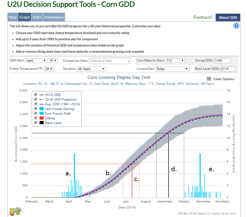
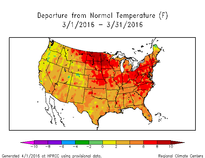
As I posted  last week, we are finishing up a 5-year USDA project called Useful to Usable (U2U), which is designed to provide a set of decision support tools for corn farmers. The tools can be found at www.agclimate4u.org, which redirects you to a server at Purdue University. Or you can just go directly to the tool here. A quick tutorial on the tool can be found here and a general discussion about corn production and growing degree days can be found in the Illinois Agronomy Handbook.

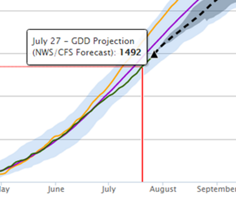
In last weeks post, we covered using the corn growing degree day (Corn GDD) tool before planting. This week I wanted to briefly cover how the Corn GDD tool looks during the growing season. This is a screenshot from July 26 of last summer (below).

The orange line is the comparison year of 2012, noted for its heat. The purple line is the 1981-2010 average. The green line is the accumulated Corn GDDs to date. The dashed line is the projected Corn GDDs using the National Weather Service (NWS) forecast out to 30 days, and the 30-year climatology after that. The lighter shading around the lines represents the historical variability of the daily Corn GDD accumulation associated with the purple line. The darker shading around the 30-day forecast represents the range of Corn GDDs based on the NWS forecast. After 30 days, the same darker shading represents the range of Corn GDD accumulations based on the remainder of the season.

corngdd-example

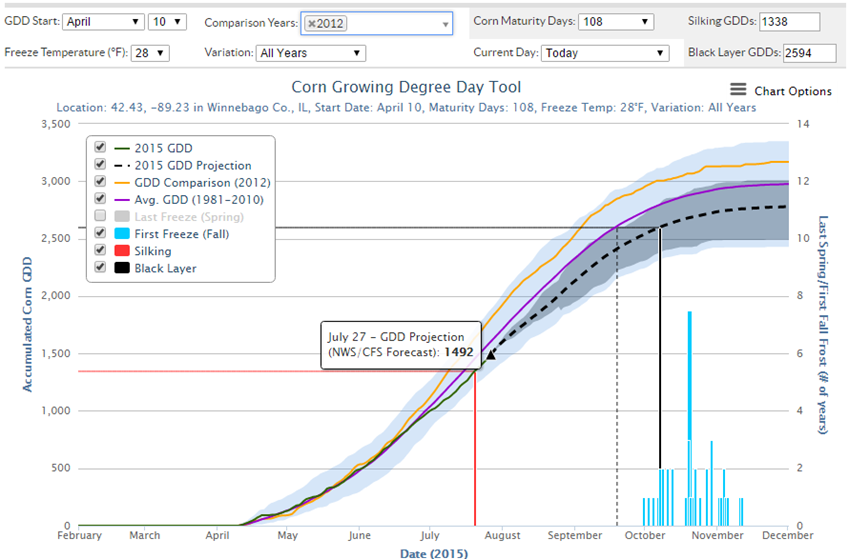
If this is too much information, you can turn lines off by clicking its label in the legend box. Also, you can move the mouse pointer over any part of the graph and get a pop-up box with more details. In this case, I had moused over the forecast line for July 27, indicating that 1492 Corn GDDs were expected to be accumulated by that date.

Here is a zoomed-in view of the above graph, showing the core of the growing season. You can see the accumulated Corn GDD for 2012 (orange line), the average (purple line), and the current year (green line), and the forecast (dashed line).

So, give the Corn GDD tool a try – it’s free!

corngdd-example2.png


April off to cold, wet start in Illinois

After the warm March, April is off to a cold, wet start in Illinois. Currently the statewide average temperature in Illinois for the first 7 days of April is 3.3 degrees below average. And precipitation across the state is near to above-average.

Here are the temperature departures, showing the surge of colder-than-average air out of Canada (thanks Canada) extending across the Great Lakes region and across much of the eastern Midwest. Temperature departures in Illinois are 1 to 5 degrees below average with the progressively darker shades of green. Continue reading “April off to cold, wet start in Illinois”

Concerned about planting corn? There is a tool for that.

We are just wrapping up a 5-year USDA project called Useful to Usable (U2U), designed to provide a set of decision support tools for corn farmers. The tools can be found at www.agclimate4u.org, which redirects you to a server at Purdue University. Or you can just go directly to the tool here. I will be talking about the tools today at 3pm in Springfield at the Crowne Plaza Hotel for the  Illinois Farm Bureau’s Governmental Affairs Leadership Conference 2016: “Change. Challenge. Opportunity.”

Tool Basics

Once you go to www.agclimate4u.org, you can select on the tab labeled “Decision Dashboard” and on the next page select Corn GDD. Once there, you can click on the map or enter your zip/city/county and in a few seconds, you will get a Corn GDD graph that looks something like this. The figure caption explains the key components. This is just a screen shot, the actual tool is very dynamic and gives you more information when the mouse pointer touches a line. Everything in the control panel can be changed. Right off the bat, this graph tells you that if you plant on April 10 that you are probably at low risk for frost (blue bars) by the time the plants emerge. And you have plenty of time for the crop to mature before the fall frost risk (2nd set of blue bars).

Presentation2
The Corn GDD graph with a) the historical dates of the last spring freeze, b) the daily accumulated GDD based on climatology, c) estimated dates of silking, d) estimated dates of black layer, and e) the dates of the first fall freeze. Above the graph is the control panel where you can set the starting date, look at comparison years, change the hybrid based on days to maturity, the freeze temperatures, etc.

Delayed Planting

Let’s say you live in Winnebago County (where the growing season is a little tighter than in central and southern Illinois), and planting is delayed until May 15 because of wet weather. Using the historical average, the estimated date of reaching the black layer is right at the average date of the fall freeze (the tall, blue line), using the default hybrid’s days to maturity.

Presentation4

In this next figure, a shorter-season corn variety was selected, which results in the estimated date for the black layer being well ahead of the fall freeze dates. Besides using this as a tool for planting decisions, I will discuss next time the features for tracking Corn GDD during the growing season.

figure5-raw