El Nino Now Likely This Summer, According to Australia

The Australian Bureau of Meteorology announced today (April 8) that for our summer (their winter):

It is now likely (estimated at a greater than 70% chance) that an El Niño will develop during the southern hemisphere winter … surface and sub-surface ocean temperatures have warmed considerably in recent weeks, consistent with a state of rapid transition [to El Niño]

The Australian Bureau of Meteorology has had a long history of monitoring and understanding conditions in the tropical Pacific Ocean because they are directly impacted. The US Climate Prediction Center’s last statement, released on March 6, indicated only a 50% chance of El Niño development by this summer and that the timing would be a little later in the season. The next US statement on conditions in the Pacific Ocean is expected to be released April 10. I suspect the odds of occurrence and timing of an El Niño event will change somewhat in that statement.

El Niño Forecast

Here is the Australian El Niño forecast for the rest of 2014, showing a rapid warming of eastern Pacific Ocean temperatures across the temperature threshold for El Niño of +0.8 C  by June, and continuing to warm for the rest of 2014.

poama.nino34.small
Source: http://www.bom.gov.au/climate/enso/#tabs=Outlooks

Sub-surface Temperatures

Another one of their figures found here, shows the sub-surface temperatures in the Pacific Ocean the TAO network of buoys in the Pacific. Imagine looking at the side of an aquarium and you could see the different water temperatures in the tank. This graph is looking at the side-glass of the Pacific Ocean right along the equator. On the left side is the western Pacific, and on the right side is the eastern Pacific (where El Niños occur).

The second panel is most interesting because it shows anomalies (i.e., differences) from the long-term average ocean temperatures. Just under the surface in the eastern Pacific between 20 and 100 meters is a large pool of warmer-than-average water. The temperatures are 2 to 5 degrees C warmer (4 to 10 degrees F). There is another larger, deeper pool farther to the west at about 150 meters. As they describe it, “this pool of warmer-than-average sub-surface water is expected to cause a further warming at the surface of the tropical Pacific, which is now likely to contribute to the formation of an El Niño” during our summer in Illinois.
sub_surf_tao


Midwest Most Productive Region in the World

According to a press release from NASA …

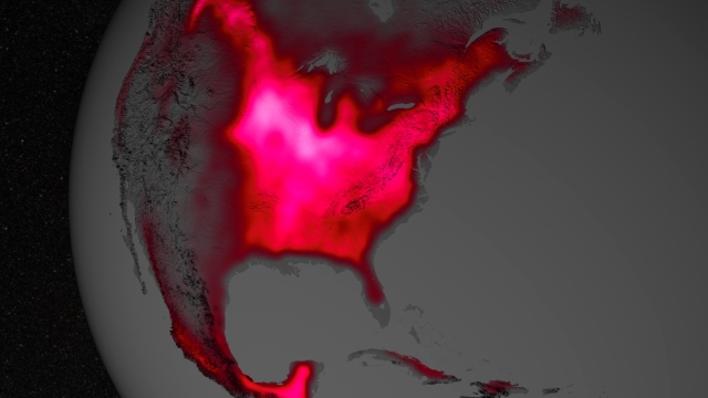
Data from satellite sensors show that during the Northern Hemisphere’s growing season, the Midwest region of the United States boasts more photosynthetic activity than any other spot on Earth, according to NASA and university scientists.

They determined this by measuring the fluorescent glow that healthy plants give off when they grow. It is not visible to the human eye but can be picked up by special sensors on satellites. The press release has a lot more details.

If you click on the map, you can see the full version. While they don’t have any state boundaries, you can make out Lake Michigan. Based on that, it looks like one of the brightest areas is across central and northern Illinois – no surprise there.

The magnitude of fluorescence portrayed in this visualization prompted researchers to take a closer look at the productivity of the U.S. Corn Belt. The glow represents fluorescence measured from land plants in early July, over a period from 2007 to 2011. Image Credit: NASA's Goddard Space Flight Center.
The magnitude of fluorescence portrayed in this visualization prompted researchers to take a closer look at the productivity of the U.S. Corn Belt. The glow represents fluorescence measured from land plants in early July, over a period from 2007 to 2011.
Image Credit: NASA’s Goddard Space Flight Center.

Tracking Tornado Statistics in the US (Part II)

Yesterday I mentioned the national archive as a source for reports on tornadoes and other forms of severe weather. Today I wanted to mention the NOAA Storm Prediction Center and the many statistical products they have available on their website. Of course, their primary mission is to provide forecasts but they have accumulated an impressive collection of other products as well.

Local Storm Reports

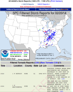
While these are preliminary and subject to change later, one of the best and longest-lived product the SPC provides are the daily storm reports. These are dot maps showing tornadoes, wind and hail damage, with a detailed list below the map showing dates, times, cities, counties, type of damage. You can see “today” and “yesterday” or pick your own date. See example below (click to enlarge).

example1

Monthly and Annual Tornado Summary

This page starts by giving you a table of running totals of tornadoes and tornado deaths for this year, and the last 3 years, plus the 3-year average. So as of April 3, we have 81 tornadoes reported across the US with zero deaths.

TORNADO TOTALS AND RELATED DEATHS...THROUGH THU APR 3 2014
NWS STORM PREDICTION CENTER NORMAN OK
0833 AM CDT FRI APR 04 2014

       ...NUMBER OF TORNADOES...  NUMBER OF          KILLER
                                  TORNADO DEATHS     TORNADOES
    ..2014.. 2013 2012 2011 3YR                 3YR             3YR
    PREL ACT  ACT  ACT  ACT  AV   14  13  12 11  AV  14 13 12 11 AV
---  --   -- ---  ---- ---- ----  --  -- --- -- ---  -- -- -- -- --
JAN   4   --   75   79  16   57    0   1   2  0   1   0  1  2  0  1
FEB  41   --   39   57  63   53    0   1  15  1   6   0  1  7  1  3
MAR  25   --   18  154  75   82    0   0  43  1  15   0  0 10  1  4
APR  11   --   86  206 758  350    0   1  6 363 123   0  1  1 43 15
MAY  --   --  268  121 326  238   --  41  0 178  73  --  5  0  9  5
JUN  --   --  125  111 160  132   --   1   4  3   3  --  1  2  1  1
JUL  --   --   72   37 103   71   --   0   0  0   0  --  0  0  0  0
AUG  --   --   46   38  57   47   --   0   0  2   1  --  0  0  2  1
SEP  --   --   21   39  51   37   --   0   0  0   0  --  0  0  0  0
OCT  --   --   61   37  23   40   --   0   0  0   0  --  0  0  0  0
NOV  --   --   79    7  44   43   --   8   0  5   4  --  3  0  2  2
DEC  --   --   18   53  15   29   --   2   0  0   1  --  2  0  0  1
---  --   --  ---  ---- ---- ----  --  -- --- -- ---  -- -- -- -- --
SUM  81   --  908 939 1691 1179    0  55  70 553 227  0  14 22 59 33

PREL = 2014 PRELIMINARY COUNT FROM ALL NWS LOCAL STORM REPORTS.
ACT  = ACTUAL TORNADO COUNT BASED ON NWS STORM DATA SUBMISSIONS.

COMPARISONS BETWEEN PRELIMINARY AND ACTUAL COUNTS SHOULD BE AVOIDED.

..CARBIN..04/04/2014

And if you look beyond the table you can get a year by year summary for the US. For example, here is the summary for 2014 so far.

example3


I like to check the Illinois statistics periodically so I choose the year and then the state and look at reports like this one …

example2


Annual Fatal Tornado Summary

This is a nice, modern interface for mapping fatal tornadoes across the US.

Annual Fatal Tornado Summaries

Warning Coordination Meteorologist page

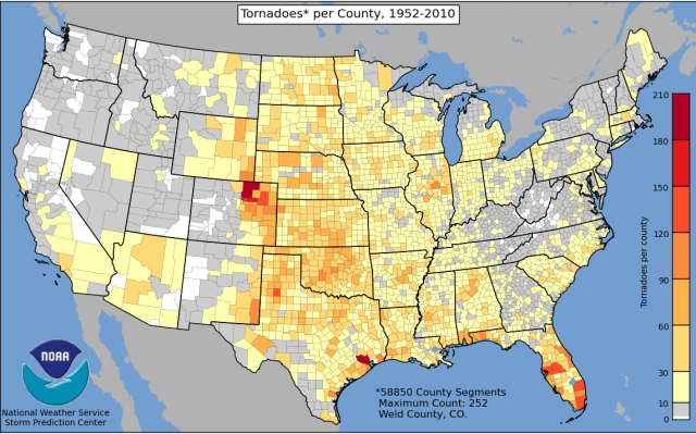
Because this page is geared towards NWS meteorologists, it has more extensive and technical information than the other pages. However, it has lots of information of general information. You can find maps of tornadoes by year, basic tornado climatology, number of watches issued by year, severe weather databases, and GIS support. For example, you can find the map of the number of tornadoes by county across the US.

tornadoes-by-county

Tracking Tornado Statistics in the US (Part I)

There are several great resources for tracking historical tornado information across the U.S. Of course, for Illinois I have a web page devoted to tornadoes here. The two major US sources are the NOAA National Climatic Data Center and the NOAA Storm Prediction Center. The first site is great for generating reports while the second site has a wealth of maps and plots. In fact, the second site has so much material that I will address that one in a separate post.

National Climatic Data Center

The URL for their database is https://www.ncdc.noaa.gov/stormevents/ and it allows you to select the state, a range of dates, type of events (tornadoes, hail, etc.) and which counties you want. It will come back with a list of reports, which you can then click on each one to get the full report. It is great for documenting severe weather. Below is an example of the kind of report you can expect.

My suggestion is that you start your search over a small geographic area and a short time span to get quicker results. Here is an example of the kind of detail in their reports. The reports span the period of January 1996 to December 2013 and is updated periodically.

ncdc
Click to enlarge.